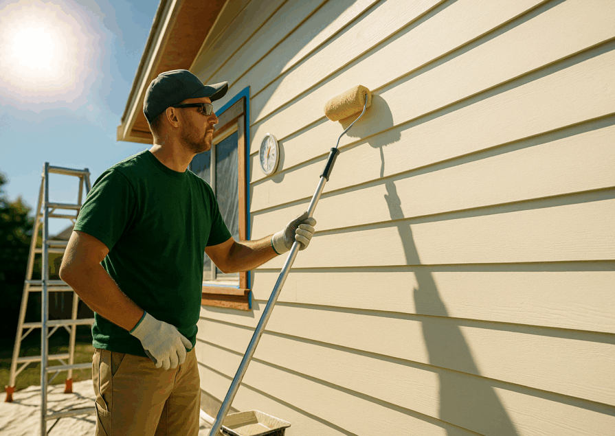
When it comes to transforming your home, few things are as impactful as choosing the right paint colors. The colors you select can change the mood, the perceived size, and the functionality of each room in your house. Whether you’re looking to create a peaceful bedroom retreat, a lively kitchen, or a welcoming living room, understanding how different colors work in various spaces is key to creating a home that truly reflects your style and meets your needs.
The Role of Paint Colors in Your Home
Paint color is not just about aesthetics. It plays a critical role in defining the mood, energy, and even the functionality of each room. Different colors evoke different emotions, and using them strategically can help you craft spaces that are calming, energizing, or cozy, depending on the room’s purpose. To make informed choices, it’s important to consider how paint colors influence both the psychological and physical experience of your home.
How Paint Colors Influence Mood and Atmosphere
Colors have the unique ability to affect our emotions and overall mood. For instance, soft blues and greens can create a calming atmosphere, while bright yellows and reds bring energy and excitement into a space. It’s crucial to think about how you want to feel in each room.
For example:
- Blues: Calm, serene, perfect for bedrooms and bathrooms.
- Greens: Balanced, refreshing, great for living rooms and kitchens.
- Reds: Energizing and passionate, ideal for accent walls in dining rooms or home offices.
These psychological effects make it essential to align your paint color choices with the specific function and desired atmosphere of each room.
Color Psychology: A Brief Overview
Understanding the basics of color psychology can help you design rooms that meet both your aesthetic and emotional goals. Here’s a quick overview of what different colors typically convey:
| Color | Emotion/Effect | Best Room |
| Blue | Calm, relaxation | Bedrooms, bathrooms |
| Yellow | Happiness, energy | Kitchens, dining rooms |
| Green | Balance, refreshment | Living rooms, kitchens |
| Red | Energy, passion | Dining rooms, accent walls |
| Gray | Neutral, balanced | Entryways, living rooms |
| White | Clean, fresh | Bathrooms, kitchens |
This basic understanding of how colors impact mood can serve as a starting point for selecting the right shades for each room.
Common Mistakes to Avoid When Choosing Paint Colors
While choosing paint colors might seem straightforward, there are common pitfalls that many people fall into. Avoiding these mistakes can save you time, money, and frustration:
- Ignoring Natural Light: Natural light can drastically alter how a paint color looks. Always test colors in the room at different times of the day.
- Choosing Colors That Clash with Furniture: Consider your existing furniture and décor when selecting paint colors to ensure harmony.
- Using Too Many Bold Colors: While bold colors can make a statement, too many in one space can create visual clutter.
- Forgetting About Finish: The type of finish (e.g., matte, satin, gloss) can affect how the color appears and how easy it is to maintain.
Living Room Paint Color Ideas
The living room is a space for relaxation, entertainment, and socializing, so the paint colors you choose should reflect the mood you want to create. Whether you prefer a serene, neutral space or a lively, vibrant atmosphere, the right paint color can make all the difference.
Warm vs. Cool Tones for Living Rooms
When deciding on a color palette for your living room, understanding the difference between warm and cool tones is essential.
- Warm Tones: Colors like red, orange, and yellow bring warmth and coziness, making a living room feel inviting. These colors are especially great for creating intimate settings during the colder months.
- Cool Tones: Shades of blue, green, and purple give a living room a fresh, airy feel. Cool tones can make a room appear more spacious and calming, ideal for relaxing or unwinding after a long day.
When deciding between warm and cool tones, consider the overall vibe you want your living room to have.
Best Neutral Paint Colors for Living Rooms
If you’re aiming for a timeless look that won’t overpower your décor, neutral colors are your best bet. Neutrals work well with almost any design style and allow flexibility when it comes to changing furniture or accessories. Some of the best neutral paint colors for living rooms include:
- Greige (Gray + Beige): A sophisticated, versatile shade that pairs beautifully with both cool and warm accents.
- Soft Whites: Clean and classic, white walls provide a blank canvas for colorful décor.
- Muted Grays: Offering a cool and serene aesthetic, muted grays are perfect for a modern or minimalist living room.
Neutrals also help create a balanced look, making them perfect for living spaces that need to accommodate various activities, from watching TV to hosting guests.
Bold and Vibrant Colors for Accent Walls
Adding an accent wall with a bold, vibrant color can instantly transform the feel of your living room. Whether you choose a rich teal, deep red, or bright yellow, an accent wall allows you to introduce color without overwhelming the space. Here are some tips for choosing the perfect accent wall color:
- Choose a Wall with Visual Interest: Accent walls work best when they’re the focal point of the room, such as behind a sofa or fireplace.
- Coordinate with Furniture and Décor: Pick an accent color that complements your existing furniture and decorative items.
- Balance the Room: If you choose a bold color, balance it with neutral tones on the other walls to avoid making the room feel too busy.
Accent walls provide an opportunity to be creative and make a statement without committing to a full-room color change.
Best Paint Colors for Kitchens
The kitchen is often the heart of the home, and its color scheme can set the tone for the entire house. Whether you prefer bright and bold or soft and subtle, the right color can create a welcoming, functional space. Paint colors for kitchens should not only enhance the aesthetics but also withstand daily wear and tear, especially in high-traffic areas.
Bright and Energizing Colors for the Kitchen
Bright colors can make your kitchen feel lively and energetic, ideal for families who spend a lot of time cooking, eating, and socializing. Here are some bold and bright options:
- Sunny Yellow: This cheerful color creates a warm, welcoming space. Yellow reflects light, making the kitchen feel larger and brighter, especially if it doesn’t get much natural light.
- Vibrant Red or Orange: Red and orange are stimulating colors that can increase appetite and excitement. A red backsplash or orange accents can inject energy into a modern kitchen design.
- Apple Green: This vibrant shade of green adds a refreshing, nature-inspired look to any kitchen. It’s both energizing and fun, working well with white or wood cabinetry.
If you want your kitchen to be a space full of life and vitality, these bright colors will help set the right mood.
Soft and Subtle Colors for Small Kitchens
For smaller kitchens, soft and subtle colors can help open up the space and make it feel more airy and expansive. Lighter shades reflect more light, which can make a compact kitchen appear larger.
- Soft Gray: A light gray can create a sophisticated and calming effect, while still being versatile enough to pair with various cabinetry finishes.
- Pale Blue: Pale blue has a cooling, calming effect that makes a small kitchen feel breezy and serene. It works especially well in coastal or cottage-style kitchens.
- Cream or Off-White: Classic and clean, creamy tones make a small kitchen feel bright without the starkness of pure white. These shades also add warmth without overwhelming the space.
Lighter shades can make even the smallest kitchen feel more comfortable and inviting.
Paint Finishes for High-Traffic Areas Like Kitchens
Kitchens are high-traffic areas, so durability and ease of cleaning are key when choosing the right paint finish. Different finishes not only affect the look but also how well the paint will hold up to splatters and spills.
| Finish | Durability | Best for | Ease of Cleaning |
| Matte | Low | Ceilings, low-traffic areas | Difficult to clean, shows stains |
| Eggshell | Medium | Walls in moderate traffic areas | Easier to clean than matte |
| Satin | High | Kitchens, dining rooms, trim | Wipes clean easily |
| Semi-Gloss | Very High | Cabinets, trim, high-traffic areas | Excellent for heavy cleaning |
| Gloss | Very High | Accents, doors, trim | Resists dirt, easy to wipe clean |
For kitchens, satin or semi-gloss finishes are ideal because they are more resistant to moisture and can be easily cleaned after cooking messes.
Best Paint Colors for Bedrooms
Your bedroom is your personal sanctuary, and the paint colors you choose can help promote rest, relaxation, or even creativity, depending on your needs. Whether you’re designing a master suite or decorating a child’s room, the right colors can make all the difference in setting the tone for sleep and relaxation.
Calming Colors for Better Sleep
If you want your bedroom to be a space for rest and relaxation, calming, soft colors are the way to go. These shades are known to reduce stress and create a peaceful atmosphere conducive to sleep.
- Soft Blue: One of the most popular bedroom colors, soft blue is known for its calming effect. It promotes relaxation and helps lower heart rates, making it a great choice for a restful night’s sleep.
- Lavender: This light purple shade brings a sense of calm and tranquility to the bedroom, while also adding a touch of elegance.
- Pastel Green: Green evokes nature and renewal. A soft pastel green can be both calming and refreshing, perfect for promoting balance and relaxation.
These colors are ideal for turning your bedroom into a restful retreat where sleep comes easily.
Best Paint Colors for Kids’ Bedrooms
When it comes to kids’ bedrooms, you can be a little more playful with color choices. Bright, fun colors can inspire creativity and energy, while softer shades may help create a more soothing environment for sleep.
- Bright Yellow: A sunny, happy color that can energize a room and make it feel joyful. This is a great option for active kids who love playtime.
- Sky Blue: Blue has a calming effect, but lighter shades can still feel fun and playful for kids. It’s a great choice for a room that doubles as a sleep and play space.
- Lavender or Light Pink: These soft colors are both soothing and sweet, making them perfect for a little girl’s room or a calm space for younger children.
You can also mix and match these shades to create a dynamic and colorful environment for your kids.
Combining Warm and Cool Tones in the Master Bedroom
Creating a balanced master bedroom can often involve combining both warm and cool tones. This contrast can add depth to the space and allow you to incorporate both calming and energizing elements.
- Warm Grays and Cool Blues: Gray works well as a neutral backdrop, while blue can bring a cooling, tranquil feel to the room. Together, they create a sophisticated yet restful environment.
- Beige and Soft Green: Beige brings warmth and coziness, while soft green adds a refreshing element. This pairing can work well if you want a natural, earthy bedroom design.
- Taupe with Pale Blue Accents: A taupe base brings warmth to the room, while pale blue adds a touch of cool contrast. This combination offers a timeless, serene feel.
Mixing warm and cool tones in the master bedroom allows you to achieve both comfort and style without overpowering the space.
Bathroom Paint Color Ideas
The bathroom is a space where function meets relaxation, and the right paint colors can enhance both. From choosing hues that make small bathrooms feel larger to creating a serene, spa-like atmosphere, the colors you use in your bathroom are important. It’s also essential to consider moisture-resistant options to ensure longevity and durability.
Best Colors for Small Bathrooms
If you have a small bathroom, lighter colors are typically best as they can create the illusion of a larger, more open space. Here are a few of the best color options for making a compact bathroom feel more spacious:
- Soft White: A classic choice, white reflects the most light, making the bathroom feel open and clean. Pair it with light-colored tiles or natural wood for a minimalist look.
- Light Blue: A pale blue shade can bring a calming, refreshing vibe to a small bathroom while also making the space feel airy and serene.
- Pale Gray: Gray is a sophisticated neutral that works well in small bathrooms. Opt for lighter shades to prevent the room from feeling cramped.
These lighter colors help maximize the space by reflecting light, which is especially important if your bathroom lacks natural light.
Moisture-Resistant Paint Options for Bathrooms
Bathrooms are exposed to high levels of humidity, so it’s crucial to select moisture-resistant paint to prevent peeling, mold, and mildew. Here’s a comparison of some of the best moisture-resistant paint options for bathrooms:
| Type | Moisture Resistance | Best for | Durability |
| Satin Finish | High | Walls and ceilings | Good for high humidity |
| Semi-Gloss Finish | Very High | Trim, doors, cabinets | Excellent for moisture |
| Eggshell Finish | Medium | Low-moisture areas | Less durable in high-moisture spaces |
| Mold-Resistant Paint | Very High | High-humidity areas | Prevents mold/mildew |
Semi-gloss and mold-resistant paints are the most effective for areas that experience a lot of moisture, such as bathrooms. They provide excellent durability and easy cleaning, ensuring your bathroom walls stand up to daily use.
Color Palettes for a Spa-Like Bathroom
If you’re looking to create a calming, spa-like atmosphere in your bathroom, stick to soft, neutral tones that evoke peace and relaxation. Here are some of the best color palettes for achieving a spa feel:
- Soft Beige and White: A combination of warm beige and crisp white creates a tranquil, clean environment reminiscent of a luxurious spa.
- Pale Green and Gray: Light green paired with soft gray evokes the natural world, bringing a fresh, soothing vibe to your bathroom.
- Muted Blues with White Accents: Muted blue walls combined with white tiles or cabinetry deliver a coastal, refreshing ambiance perfect for unwinding after a long day.
These subtle color combinations will help you turn your bathroom into a serene retreat.
Home Office Paint Colors for Productivity
Your home office is a space where focus and creativity should flourish. The colors you choose for this area can directly impact your mood, productivity, and even creativity levels. Whether you want to create a vibrant, energetic workspace or a calm, focused environment, the right paint color can make all the difference.
Colors That Boost Focus and Creativity
Certain colors are known to enhance focus and spark creativity, making them perfect for a home office. Here are a few shades that can help you stay on task and stimulate fresh ideas:
- Light Green: Green is the color of nature, symbolizing growth and balance. It’s known to increase focus while also being easy on the eyes, making it perfect for long work sessions.
- Vibrant Blue: Blue is often associated with calm and focus, but a more vibrant shade of blue can also spark creativity and productivity. It’s ideal for spaces where you need both concentration and inspiration.
- Warm Yellow: Yellow is a stimulating and energizing color that can boost creativity and enthusiasm. It works well in spaces that require brainstorming or creative work.
By using colors that promote both focus and creativity, your home office can become a space where productivity thrives.
Light vs. Dark Tones: Which is Better for a Home Office?
The choice between light and dark tones in a home office largely depends on the type of work you do and the atmosphere you want to create.
- Light Tones: Light colors, such as pale blues, whites, or soft grays, help reflect light and make the space feel larger and more open. These shades are ideal if you want a clean, minimalist environment where focus is key. Light colors also work well in smaller home offices that need to feel more spacious.
- Dark Tones: Darker colors, like deep navy, charcoal, or forest green, create a cozy, intimate space that can help you feel grounded and focused. Dark tones work especially well in larger rooms and can create a dramatic, sophisticated look. However, they may not be ideal in spaces with limited natural light, as they can make the room feel smaller and dimmer.
Ultimately, your choice between light and dark tones should reflect the type of environment that helps you work best.
Hallways and Entryway Paint Ideas
Hallways and entryways often set the first impression for your home. The right paint colors can make these transitional spaces feel welcoming, open, and cohesive with the rest of your home’s design. Since these areas tend to be smaller or lack natural light, choosing the right shades is essential to creating a warm and inviting atmosphere.
Creating a Welcoming Entryway with Paint Colors
Your entryway is the first space guests see, so it’s important to choose colors that create a sense of warmth and hospitality. Here are a few paint color ideas to make your entryway feel inviting:
- Warm Beige: A warm beige or light taupe can create an elegant and timeless entryway that feels both cozy and classic.
- Soft Green: A soft, muted green brings in an earthy, nature-inspired vibe that feels fresh and welcoming.
- Light Blue or Soft Gray: Light blue or gray are both neutral but calming colors that can brighten up the space while setting a serene tone for the rest of your home.
These colors can help create an inviting first impression and set the stage for the rest of your home’s decor.
How to Make Narrow Hallways Appear Bigger with Paint
If you have a narrow hallway, you can use paint strategically to make the space appear larger and more open. Here are a few tips:
- Light, Reflective Colors: Choose light, reflective colors like soft white, light gray, or pale pastels to open up the hallway. These colors reflect more light, making the space feel airy and expansive.
- Accent Wall at the End: Painting the farthest wall a darker color can give the illusion of depth, making the hallway appear longer.
- Consistent Color Flow: Use the same color for both the walls and the ceiling to create a seamless flow that visually expands the space.
With the right paint choices, you can turn a narrow hallway into a more open, inviting area that leads effortlessly into other rooms.
The Best Paint Colors for Dining Rooms
The dining room is a space where you gather with family and friends to share meals, so the paint colors you choose should reflect the mood you want to create. Whether you prefer a formal, elegant dining room or a casual, relaxed setting, the right color palette can enhance the overall dining experience.
Formal vs. Casual Dining Room Colors
When choosing paint colors for a dining room, the formality of the space can influence your decision. Here are some options for both formal and casual dining room designs:
- Formal Dining Rooms: For a formal dining room, rich, deep colors like navy blue, charcoal gray, or burgundy can add an air of elegance and sophistication. These darker shades create a dramatic and luxurious atmosphere, ideal for hosting special occasions.
- Casual Dining Rooms: For a more relaxed and informal dining area, light and neutral tones like soft beige, light gray, or pale blue work well. These colors create a calm, inviting space that feels comfortable for everyday meals.
By aligning your paint colors with the level of formality, you can enhance the ambiance of your dining space and make it more suited to your needs.
Using Accent Walls to Elevate the Dining Experience
Accent walls are a great way to add depth and personality to your dining room without overwhelming the entire space. Here’s how to use accent walls effectively:
- Bold Colors for a Focal Point: Choose a rich, bold color like deep green, maroon, or dark blue for one wall to create a striking focal point. This works especially well if your furniture and décor are more neutral.
- Wallpaper or Textured Paint: Consider using patterned wallpaper or textured paint on the accent wall to add visual interest and break up a monotone color scheme.
- Complement the Decor: Make sure your accent wall color complements your dining room furniture and other décor elements, like artwork or curtains, to create a cohesive look.
An accent wall can instantly elevate your dining room and make the space feel more dynamic and interesting.
Paint Finishes for Different Rooms
The type of paint finish you choose can significantly impact both the look and functionality of your room. Different finishes provide varying levels of durability, shine, and ease of cleaning, making them better suited for certain areas of the home. Understanding when to use matte, satin, or semi-gloss finishes will help you make the best choice for each room.
When to Use Matte, Satin, and Semi-Gloss Finishes
Here’s a guide to choosing the right paint finish for different rooms in your home:
| Finish | Best For | Durability | Appearance |
| Matte | Low-traffic areas (e.g., bedrooms, ceilings) | Low | Flat, non-reflective |
| Eggshell | Moderate-traffic areas (e.g., living rooms) | Medium | Slight sheen |
| Satin | High-traffic areas (e.g., kitchens, bathrooms) | High | Soft sheen |
| Semi-Gloss | High-moisture areas (e.g., kitchens, trim) | Very High | Glossy, reflective |
| Gloss | Accents (e.g., doors, trim) | Very High | Very shiny, reflective |
- Matte is best for ceilings and low-traffic rooms where you want a smooth, non-reflective finish.
- Satin offers a bit of sheen and is easier to clean, making it ideal for kitchens, bathrooms, and hallways.
- Semi-gloss is highly durable and resistant to moisture, making it perfect for high-traffic areas like kitchens, trim, and kids’ rooms.
Choosing the right finish can make your paint job more durable and easier to maintain.
Best Paint Finish for High-Humidity Rooms
In high-humidity areas like bathrooms, kitchens, or laundry rooms, durability is key. These spaces are prone to moisture, so you’ll need a paint finish that can withstand damp conditions without peeling or developing mold.
- Semi-Gloss: Semi-gloss is one of the best finishes for high-humidity rooms because it is moisture-resistant and easy to clean. Its glossy surface prevents water from seeping into the walls, which helps to protect against mold and mildew.
- Satin: Satin is also a good option for humid areas, providing a softer sheen than semi-gloss but still offering resistance to moisture and staining.
For bathrooms and kitchens, always opt for a finish that is easy to clean and resists the wear and tear associated with high humidity levels.
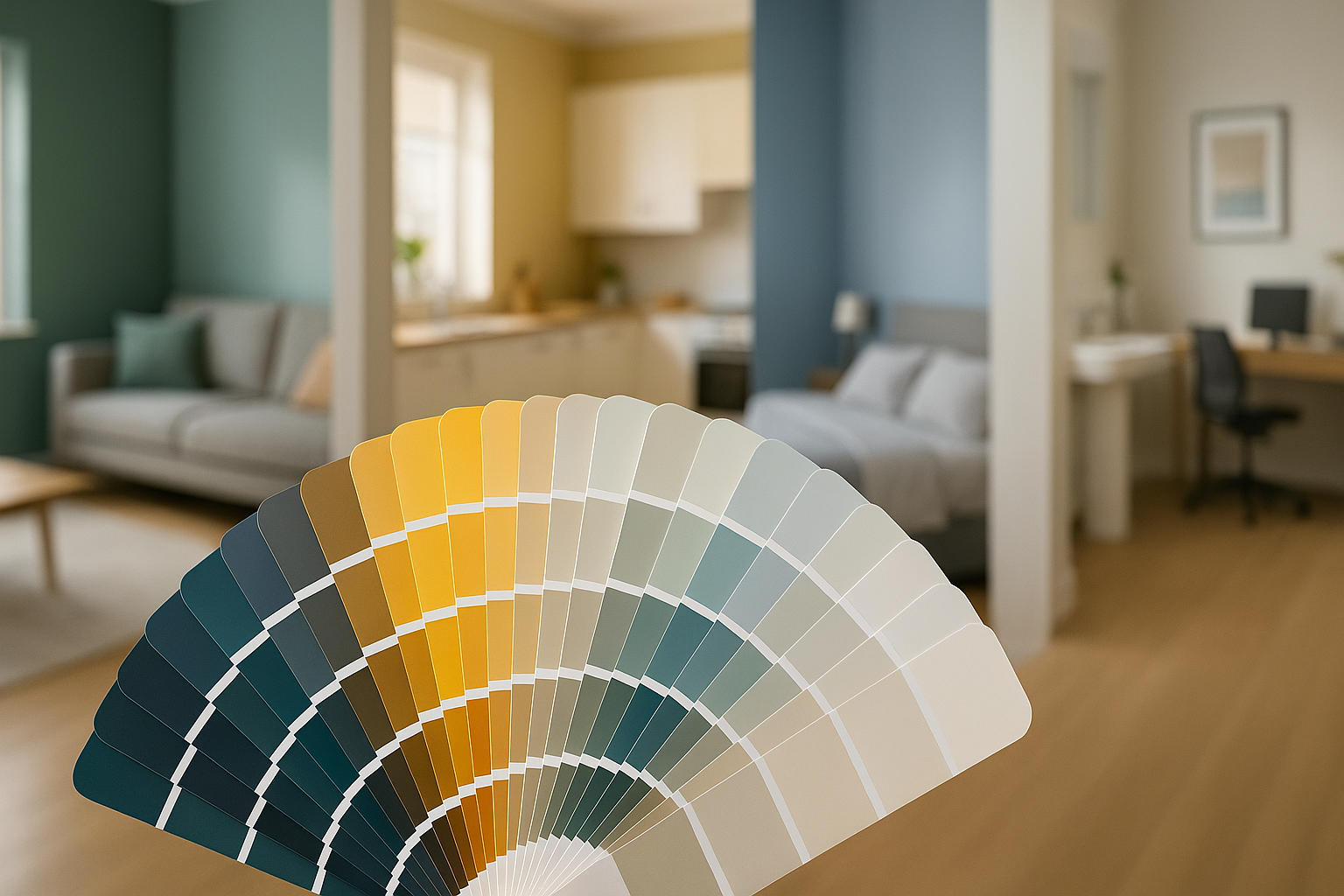
How to Test Paint Colors Before Committing
Choosing the right paint color can be a daunting task, and it’s essential to test colors in your home before fully committing to them. Lighting, room size, and existing furniture can all influence how a paint color appears, so sampling paint on your walls is a crucial step in making the right choice.
The Importance of Sampling Paint on Your Walls
Sampling paint colors on your walls allows you to see how the shade looks in your unique space. This is important because colors can appear differently based on lighting, room size, and the surrounding décor. By testing paint samples, you can avoid costly mistakes and ensure you’re happy with the final look.
When sampling:
- Apply a large enough area: Paint a 2×2-foot section to get a clear picture of how the color will look over a larger surface.
- Use different walls: Sample on walls with varying light exposure (i.e., near windows, in corners, etc.) to see how the color changes.
- Allow drying time: Paint may change as it dries, so wait 24 hours to fully assess the color.
Sampling directly on your walls helps you make an informed decision, ensuring the color is just right for your space.
Tips for Evaluating Paint Color in Different Lighting
Lighting can dramatically alter how a paint color looks throughout the day. To get an accurate sense of how a color will appear in your space, it’s essential to evaluate it under different lighting conditions:
- Natural Light: In rooms with abundant natural light, paint colors tend to appear brighter and cooler. Evaluate the paint during the day, paying attention to how the sunlight affects its shade.
- Artificial Lighting: Depending on the type of bulbs used (warm, cool, or daylight), artificial lighting can either warm up or cool down a paint color. Make sure to check the color at night with lamps and overhead lights on to see how it changes.
- Shadows and Corners: Shadows in corners and near doors can affect how dark or light a color appears. Test the paint in these areas to ensure you like the way it looks in all parts of the room.
By taking the time to observe paint in different lighting conditions, you’ll get a clearer idea of how the color will truly look in your home.
Conclusion
Choosing the right paint colors for your home is a blend of understanding color psychology, the function of each room, and how lighting and space impact the way colors appear. Testing paint samples on your walls and considering the finish can make a big difference in achieving the look you want. With careful planning and consideration, you can transform your home into a beautiful, cohesive space that reflects your personal style.
Final Thoughts on Choosing the Best Paint Colors
Selecting paint colors for your home can be overwhelming, but it doesn’t have to be. By understanding how colors influence mood, evaluating the space and lighting, and carefully testing samples, you can make informed choices that you’ll love for years to come. Whether you’re going bold with an accent wall or opting for soothing neutrals, the right paint colors will enhance the function and feel of every room in your home.
FAQs
How do I choose the right paint color for an open-concept living space?
When choosing paint for an open-concept space, it’s important to create flow between areas while also defining each space. Neutral colors like beige, soft gray, or light blue work well as a base, allowing you to incorporate accent walls or décor to differentiate spaces like the kitchen or dining area.
Are there any paint colors that make a room look bigger?
Yes, light colors such as soft whites, light grays, and pale blues can make a room appear larger. These shades reflect more light, creating an airy and open feel. Avoid dark or overly bold colors in small rooms, as they can make the space feel enclosed.
Which paint colors work best for north-facing rooms with low natural light?
North-facing rooms tend to have cooler light, which can make colors appear duller. To brighten these spaces, opt for warm, light colors such as creamy whites, soft yellows, or warm beige. These colors help counterbalance the cool lighting and add warmth to the room.
Should I use the same paint color throughout my entire house?
Using the same color throughout the house can create a sense of continuity and flow, especially in smaller homes. However, adding subtle variations in color or accent walls can help define different spaces and add interest to your home’s design.
How often should I repaint each room in my home?
The frequency of repainting depends on the room’s usage. High-traffic areas like hallways and kitchens may need to be repainted every 3-5 years, while less-used rooms like guest bedrooms can go 7-10 years before needing a refresh. High-moisture areas like bathrooms may need more frequent touch-ups due to humidity.