The unveiling of each year’s colours by major paint companies has become an anticipated spectacle in interior design. This year is no exception, with giants like Sherwin-Williams presenting the light and airy Upward and Benjamin Moore captivating us with the enchanting Blue Nova. A noticeable shift in the trend reports was the departure from a singular colour of the year towards a collection, reflecting the diversity and individuality of personal spaces.
But how can you incorporate these upcoming colour trends into your home’s interior spaces? We looked at some of the top interior design sources to provide a sneak peek into the colours shaping 2024, with some expert tips.
How to Choose Paint Colours for Any Room
Small rooms – For cozy nooks or smaller spaces, opt for lighter colours. Embrace boldness strategically; rich dark hues can work as accent colours but be cautious not to overpower the room, especially if lacking natural light.
Medium rooms – Pick colours based on the room’s unique elements. For instance, consider your drawers and cabinets when picking a colour for your kitchen. Light colours are generally great, but if your space has trendy surfaces, bolder colours can complement this well. To maintain a clean and bright atmosphere, avoid dark colours especially if the space lacks large windows that provide ample lighting.
Large Rooms – You can be more creative with colour choices in larger spaces. Bright, bold colours add life and zest into plain living or family rooms. For a relaxing master bedroom, consider rich blues or greens. Purples and warm blues enhance a romantic bedroom atmosphere, but steer clear of red as it can turn dark in low light.
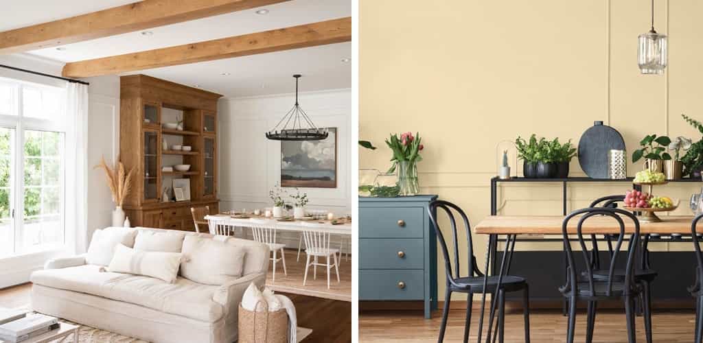
Furnishings – It is essential to pick harmonious colours with your existing furniture. Typically, neutral-coloured black or white furnishings offer the most flexibility as they pair well with various wall colours. However, the naturally inspired hues this season pair wonderfully with wooden furniture as you’ll see below.
Plan Your Colours – You can use colour simulators online to help you select colours that complement rather than clash with your existing furniture. Our favourites are the Dulux Colour Visualizer, Sherwin-Williams Color Snap Visualizer, and Benjamin Moore Colour Viewer. When uploading your own photos, ensure that lighting is bright and evenly diffused for accurate visualization.
Now that you’ve got the knack for picking paint colours, let’s dive into the hues that are stealing the spotlight this season.
Colour of the Year 2024 Forecasts
Calming Blues
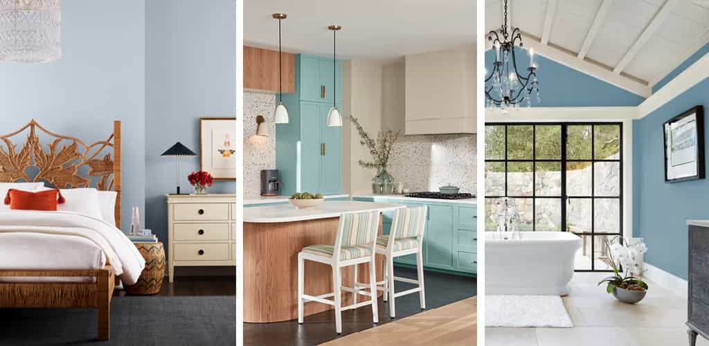
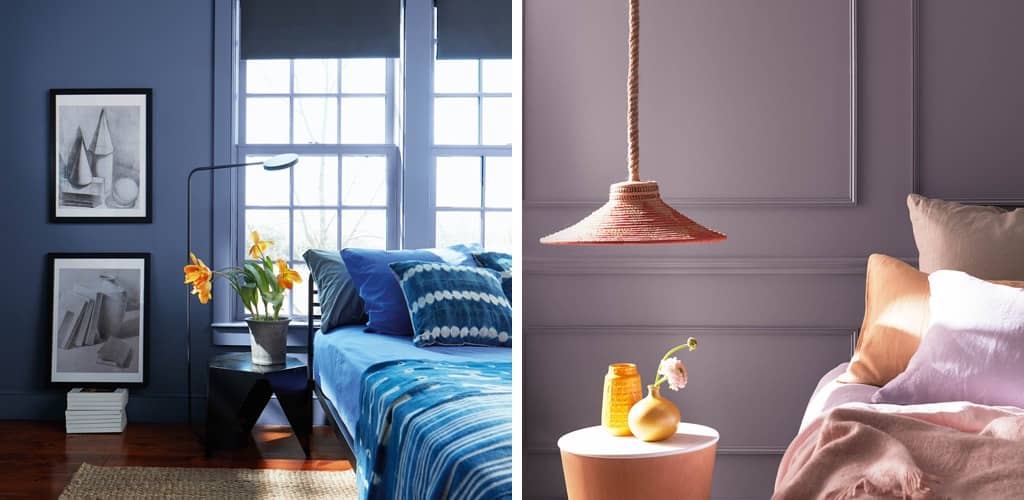
The blues in 2024 echo the soothing trend from 2023 with a continued focus on creating calm, restorative spaces away from the busy outer world. Colours that contribute to this soothing atmosphere are Upward (Sherwin-Williams) with its light airy hue, Renew Blue (Valspar) with sea green, and Skipping Stones (Dunn-Edwards) with its mid tone blues.
Warm Neutrals
Classic neutrals like White Dove (Benjamin Moore) gracefully contrast with the bold and darker tones that are becoming more mainstream. Cool greys are officially out, making way for warmer neutrals. New this season are whites and greys with warm yellow undertones like Limitless (PPG).
Earthy Greens & Yellows
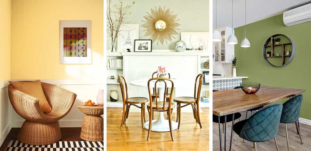
Since greens became the top colour trends in 2022, the natural world continues to be a strong inspiration this season. Apart from the variety of greens such as Honeydew and Leapfrog Green (Sherwin Williams) there are also soft, muted yellows like Honeybee (Benjamin Moore).
Softer Reds
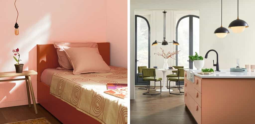
Bold hues of the previous year return in lighter versions. For instance, Teacup Rose (Benjamin Moore) finds its place in larger spaces, adding warmth without being too overpowering. Persimmon (Sherwin-Williams) offers a lighter terracotta ideal for kitchens, gathering spaces, or home offices.
Dark Hues
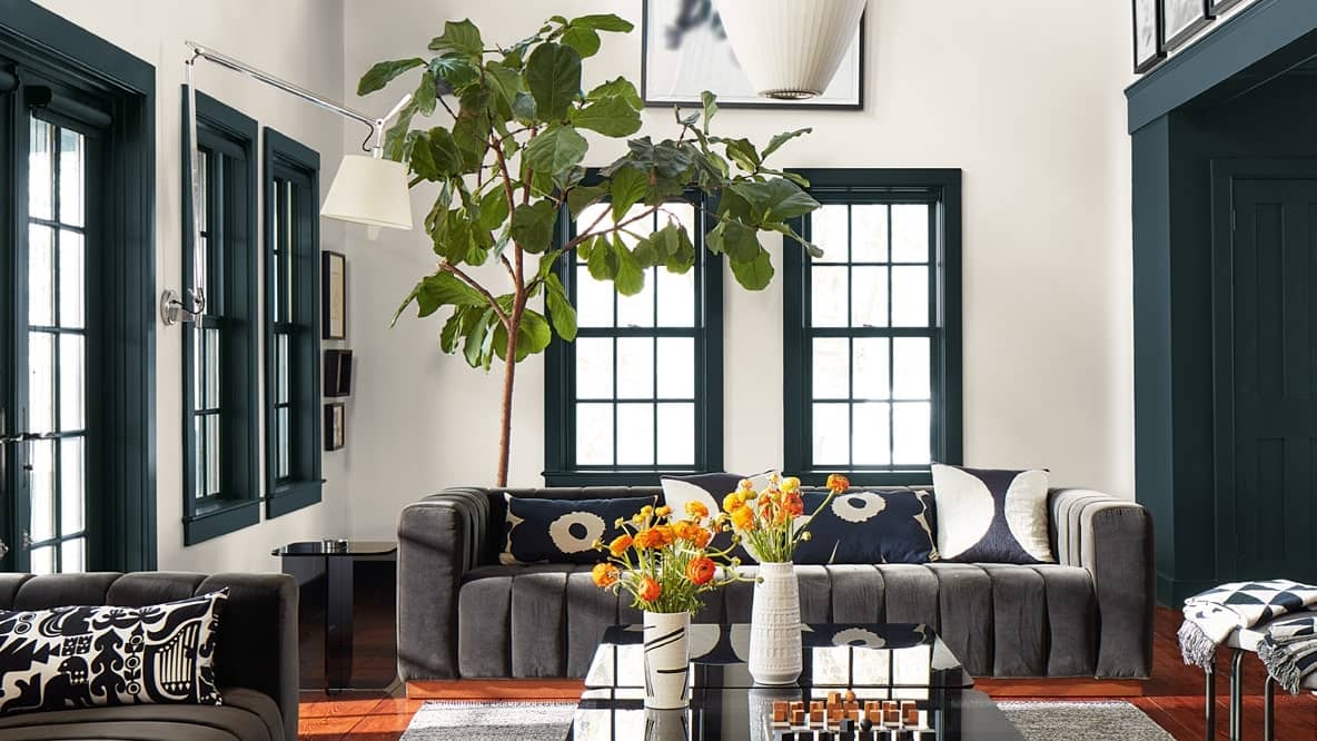
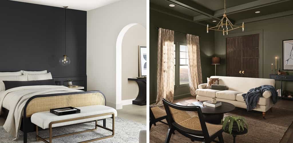
Darker tones continue to thrive, creating dramatic, sophisticated atmospheres. Blue Nova and Hazy Lilac (Benjamin Moore) offer a cool, decadent ambiance. Cracked Pepper (Behr) works great on accent walls that serve as a backdrop to architectural features or furniture. Ironside (Dutch Boy) is a rich, dark olive that exudes a deep, earthy touch. These colours work wonders, especially when paired with copper and vintage decor.
A Preview Into Spring Style
Expect to see more of these colours in home decor moving into the spring season. Colour of the Year reports and trend forecasts can help you incorporate these hues into your space, whether through painted walls, furniture, or home accessories. It’s all about personal expression and creating a home that reflects your style and promotes well-being.
In the daunting task of painting your home or commercial space, consider leaving it to the professionals for a stress-free experience. With years of expertise, Hemlock Painting offers high-quality services such as interior and exterior painting and colour consultation in the Lower Mainland. Call us or request a free, same-day estimate for your project today.
